Several scholars have discussed Minard’s maps in the context of the history of geography and cartography. In his study of the history of thematic maps, Robinson (1982) revealed that the Irishman Henry Drury Harness published the first flow map in 1837. In it, Drury shows “the relative quantities of traffic in different directions.” Minard’s flow map appeared only a few years later, at about the same time that Alfred Belpaire, a Belgian railway engineer, produced his transportation maps in flow line style. It remains unclear whether Minard or Belpaire knew about Harness’ work, or whether the engineers influenced each other. Robinson describes Minard’s maps as more varied and sophisticated than the other two. In another article, “Visions and re-visions of Charles Joseph Minard,” Michael Friendly pays special attention to how others have used the Frenchman’s map to explain some of today’s interactive situations. His website archive contains copies of most of Minard’s maps and provides links to other examples http://www.math.yorku.ca/SCS/Gallery/re-minard.html. In his most recent book Beautiful Evidence (2006), Tufte revisits the map in a chapter about the “fundamental principles of analytical design” (see also chapter 6).
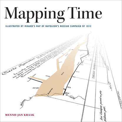
Figure 2-3. Details from Minard’s map of the French invasion of Russia: (2-3a) The Neman River, the start and end of the campaign; (2-3b) Napoleon in Moskva; (2-3c) the crossing of the Berezina River; (2-3d) the temperature diagram.
Figure 2-4. Minard’s maps and diagrams in the Library Lasage, Ecole Nationale des Ponts et Chaussées: (2-4a) the library entrance; (2-4b) the author and the map; (2-4c) Folio 28 of the collection with the combined Hannibal and Napoleon campaign maps (45 × 87 cm); 2-4d) the cover of the collection.
Minard worked at a time when innovations in both statistical graphics and thematic mapping flourished. Gilles Palsky (1996), Robinson (1982), and Friendly (2008) describe this burst of invention in detail. Noteworthy diagrams of the nineteenth century include William Playfair’s time series line graph, the bar graph, the circle diagram pie chart, and Florence Nightengale’s polar area diagram; maps include the choropleth map, dot map, flow map, and isoline map. Minard played an important role in stimulating the rise of visual thinking and explanation during this formative period. Friendly, in his Milestones website http://www.datavis.ca/milestones/, uses several of Minard’s own maps to explain how the French engineer influenced the development of statistical mapping. Minard reported in a number of his pamphlets that he had published over ten thousand copies of his maps, most of them distributed within his Ministry of Public Works. Outside France, his work attracted less attention, although he did participate in international statistical conferences to discuss his work with others and learn from them. His work grew obscure and then experienced a revival of interest at the beginning of the twentieth century; Funkhouser, for example, called him “the French Playfair.”
ABOUT MINARD
Charles Joseph Minard was born in Dijon, France, on March 24, 1781. He studied to become an engineer in Paris at the École Polytechnique and the École Nationale des Pont et Chaussées. During his early career, he was posted to several locations in France and the Low Countries in order to work on canals and ports. In 1832, he accepted a teaching and administrative position at the École Nationale des Pont et Chaussées. From 1841 on, he became the superintendent of a district in the southwestern part of Paris. In 1846, he was promoted to Inspecteur Général des Pont and Chaussées, and became a member of its directive council. He retired five years later, in 1851, at the age of seventy.
Minard’s (carto)graphic career began just before he retired as an engineer. Or, as Friendly (2002) put it: “Minard had moved from work as a civil engineer (designing canals and railways) to work as a visual engineer (designing informative visual data displays).” The engineer published his first graphic, “Tableaux figurative de la circulation de quelques chemins de fer,” in 1844 (see figure 2-6). It represents the number of passengers that traveled on several railroad lines. In 1845, he published his first map, “Carte de la circulation des voyageurs par voitures publique,” to support the planning process of a new railroad. The map illustrates the intensity of traffic that circulated between Dijon and Mulhouse. Minard published a number of maps over the course of his second career. His last known map, the combined Hannibal and Napoleon map shown in figure I-1, was published in 1869. He died in Bordeaux on October 24, 1870. An English translation of his bibliographic obituary appears on Edward Tufte’s website http://www.edwardtufte.com/tufte/minard-obit.
Charles Minard’s signature
2.2 Minard’s work
Although Minard remains best known for his map of Napoleon’s march to Moskva, he previously had produced other interesting and innovative work. His first diagram (figure 2-6) which he published in 1844, displays the number of passengers who traveled along selected railroads in France and Belgium. Ingeniously, the diagram incorporates geography. The horizontal axes, for example, represent trajectories, as illustrated in the upper right diagram, which represents the railroad from Kortrijk (left) to Brussels (right). The width of each individual diagram indicates the total distance between the two final stations. The width of each bar in the diagram marks the distance between stations along that line, while the height measures the number of passengers.
Figure 2-5. The spelling of geographic names can vary depending upon the sources used. This map displays toponyms in six different languages.
Figure 2-6. One of Minard’s early diagrams (1844), measuring traffic volume on selected railroads. (Tableaux figuratifs de la circulation de quelques chemins de fer. 1844).
It did not take Minard long to translate his diagrams into maps, which resulted in his first flow line maps. The map displayed in figure 2-7, published in 1846, is the second version of his first map. Minard created the map to give railroad authorities an impression of the potential passenger supply in the de Dijon-Mulhouse region, where a new railroad was to be built. In it, the segments of the flow line map follow the actual trajectories of the train lines as accurately as possible.
The map detail in figure 2-8 shows how Minard developed the flow line map concept further. The map’s more sophisticated design illustrates the transport of cereal within France by rail and water. The two different modes of transport are distinguished by color and by the shape of the line segments. The railroad segments move in straight lines, while those tracking river transport meander like rivers. Each segment splits into two directional flows, each marked by an arrow to indicate direction and a number to report volume. The names of the rivers or railroad tracks lie next to each segment. The coastline marks the map’s only supporting topography, since the location of place names is only approximate.
Figure 2-7. One of Minard’s early maps (1846) and one of the first flow maps ever displaying traffic volume in the region Dijon-Mulhouse. (“Carte de la circulation des voyageurs par voitures publiques sur les routes de la contrée où sera placé le chemin de fer de Dijon á Mulhouse.”)
Figure 2-8.