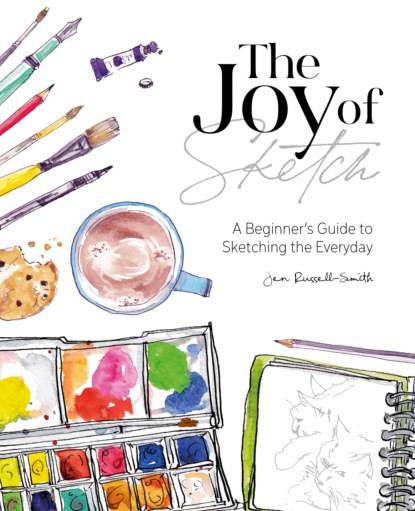
There are as many different types of pen as you can probably imagine, but if you can track down something with waterproof ink you’ll find it’s extremely versatile. I tend to add watercolour paint to my sketches and you definitely need waterproof ink for that, or it all goes terribly smudgy (a good effect, but only if you want it to happen…). I primarily use a fountain pen (although you’ll spot a few sketches where I’ve tried something different), which I fill with waterproof ink by hand, but that’s quite messy and fiddly and not necessarily what I’d recommend when you’re starting out. Most ballpoint pens are automatically waterproof, and most pen shops (you don’t need an art-specific one – a general stationers will be fine) will have a range of fine-liners or rollerballs with waterproof ink.
Paint
As with pens, there are many different types of paint. I predominately use watercolour and that’s what I’m going to focus on here, but feel free to try other types of paint if something catches your eye or interest.
You can easily pick up a basic watercolour palette from most art or stationery stores – they’re brilliant as they’re portable, easy to clean and easy to mix. Most also come with a brush so, assuming you have an old jam jar, washed-out yoghurt pot or similar for your water, you’ll have everything you need.
Paper
The wetter you’re going to get your paper, whether with paint or ink, the thicker it will need to be. You can buy specific watercolour paper which won’t buckle if you soak it, but standard cartridge paper will cope with a little bit of watercolour quite happily. Have a look over the page for a bit more information about paper and notebooks.
Other materials
Art shops are pretty much an Aladdin’s cave of interesting and intriguing materials. Some things you might want to consider if you want to branch out could include masking fluid (for keeping the watercolour off areas of your paper), sponges and different brushes for different effects, and various types of paper etc. But all those are very much optional extras, and not anything you’ll need to make a start. Keep an eye out for my ‘Take it further’ suggestions for next steps with materials.
Papers AND
SKETCHBOOKS
What you sketch on is very much a matter of personal preference, and will also be influenced by where you’re likely to be working. Sketchbooks come in a vast array of different sizes, formats and paper types, and it’s easy to get overwhelmed by all the options. I’ve also found I’ve preferred different formats at different points over the years – you may like to have several in use at any one time.
Will you be working sitting at a desk or table, or drawing quickly while standing up? Do you want to be able to fit your sketchbook into your pocket or bag – if so, how big is that pocket or bag? Does the idea of all those blank pages fill you with fear – maybe start with some loose sheets instead?
The format also can be an issue – I love Moleskine watercolour sketchbooks, but the small ones open out into a very long strip. Great for tall or wide drawings, but not so great for fitting onto my small desk! By contrast, ring-bound sketchbooks can be folded right over to minimize the space that they require.
If you think you’ll be using a lot of paint or watercolour, it is definitely worth seeking out a sketchbook made with watercolour-specific paper. It will be a little more expensive, but will take pretty much anything you throw at it. Watercolour paper comes in different types, with fairly obscure names ( ‘hot press’, ‘not’, and ‘rough’, then ‘hand’, ‘machine’ or ‘mould made’, and that’s before we even start on the weight or GSM) but you can ignore the technicalities for now – just run your finger over the paper and find one you like.
Think again about what sort of person you are – would buying a higher quality sketchbook make you feel like a ‘proper’ artist and excited to fill it? Or would it feel a little daunting, put you off filling the first page, and you’d be better off with the one you got for free with a magazine at first? Remember, your sketchbook is a tool to help you. Choose whatever you’re most likely to draw on.
Various sizes of sketchbooks from different points over the last few years
EXERCISE
Colour chart
This might look a bit technical and artistic, but it’s really very simple. Plus it’s a great way to fill that blank first page, and gives you a useful reference for the rest of your sketchbook. Mine is done with watercolour, but if you’re using something different it’s really just a case of creating a record of how each colour appears on the paper, and what happens when you mix it with others.
Watercolour paints look different in the palette compared with how they appear on the page, and the colour lightens and loses some vibrancy as it dries. A chart like this is really helpful to remind you of what the colours look like once they’re actually in use. If you arrange the chart (or create another?) in the order they appear in your palette, this can also be a useful hint as to which green is which, for example. I use a chart like this almost daily – my greens look very similar when dry, but completely different when wet and I can never remember which one I want.
You’ll see this was done with just ten initial colours – the ten little dots across the top and down the left hand side. So, create your grid: use a ruler if you’re a fan of neatness and measuring, or a wonky freehand version like mine if you prefer. Pop your colour dots along the top and side, and add in the paint names if you’d like. (I arranged mine in roughly spectrum (rainbow) order as it looks prettier, but it’s entirely up to you.)
Fill in the diagonal squares across the middle from top left to bottom right. If you look at your dots/names, you’ll see this square is where each colour ‘meets’ itself so you need the pure, unmixed colour in this diagonal line.
Then fill in the rest of the squares according to the two colours that would ‘meet’ or mix in each one. You’ll notice that each colour pairing has two squares – I’ve done the top right triangle of my chart with the darkest version possible, and the bottom left in the lightest (most watery) version.
TIP: DILUTE TO LIGHTEN
Mixing different paints together obviously produces different colours but a key thing to remember with watercolour is that the more water you add, the lighter the colour will be!
Do your best to use the same amount of paint in each mix (half and half) and remember to wash your brush well after filling each square, so you don’t end up with extra colours creeping in.
The rectangles at the bottom show the variation you can create with just one colour by increasing the amount of water you add.
Take it further...
This would technically be called a Mixing Chart. There are lots of different sorts of watercolour paint charts you can create, and all sorts of colour theory to delve into if this is something that interests you. This is where art meets science!
EXERCISE
Fill a page
DOODLES AND SCRIBBLES
The